Visual Identity Concepts for HomescapeKC
HomescapeKC wanted something modern and differentiated from what already existed.
An identity that reflected both the advanced technology he uses and the elevated quality of his work. Rather than rushing into a single look, the goal was to explore multiple creative directions to clearly define how the brand should feel, communicate, and stand apart.
Collaborations was done with a local real estate agent–turned–real estate videographer to build a brand from the ground up. Starting with only a vision and no name, I developed the Homescape KC brand and created three distinct logo directions—each designed to explore a different brand personality and market position.
The process began with naming the brand Homescape KC, anchoring it in both place and experience. From there, three unique logo concepts were designed, each representing a different strategic focus.
Technology-forward: Emphasizing advanced capabilities and innovation, with subtle references to drone technology and precision.
Vibrant & playful: A bold, eye-catching direction designed to feel energetic, modern, and instantly memorable.
Luxury & emotion-led: A refined logo focused on the beauty and feeling of the homes themselves; combining warmth, comfort, and elegance for a high-end, lifestyle-driven appeal.
This approach allowed HomescapeKC to clearly identify not just a logo, but the kind of brand he wanted to build before moving forward with a final identity.
Three Strategic Paths
Direction 01: The Innovator
A sleek aesthetic emphasizing advanced capability and modern precision
Direction 02:
The Dynamic Spirit
A vibrant playful look utilizing gradients and depth to capture the energy of a living home.
Direction 03:
The Modern Classic
A blend of tradition and innovation, exuding luxury, comfort and timeless sophistication
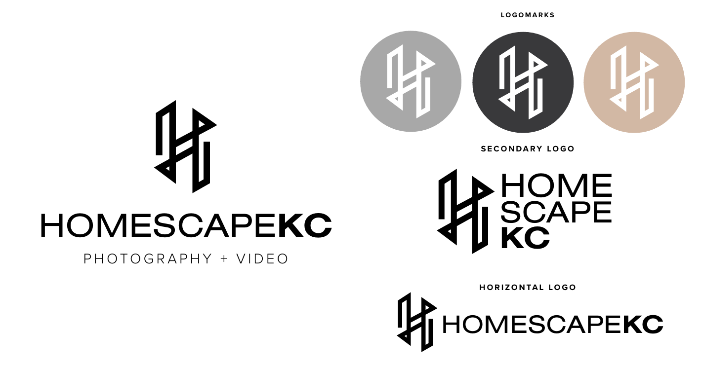
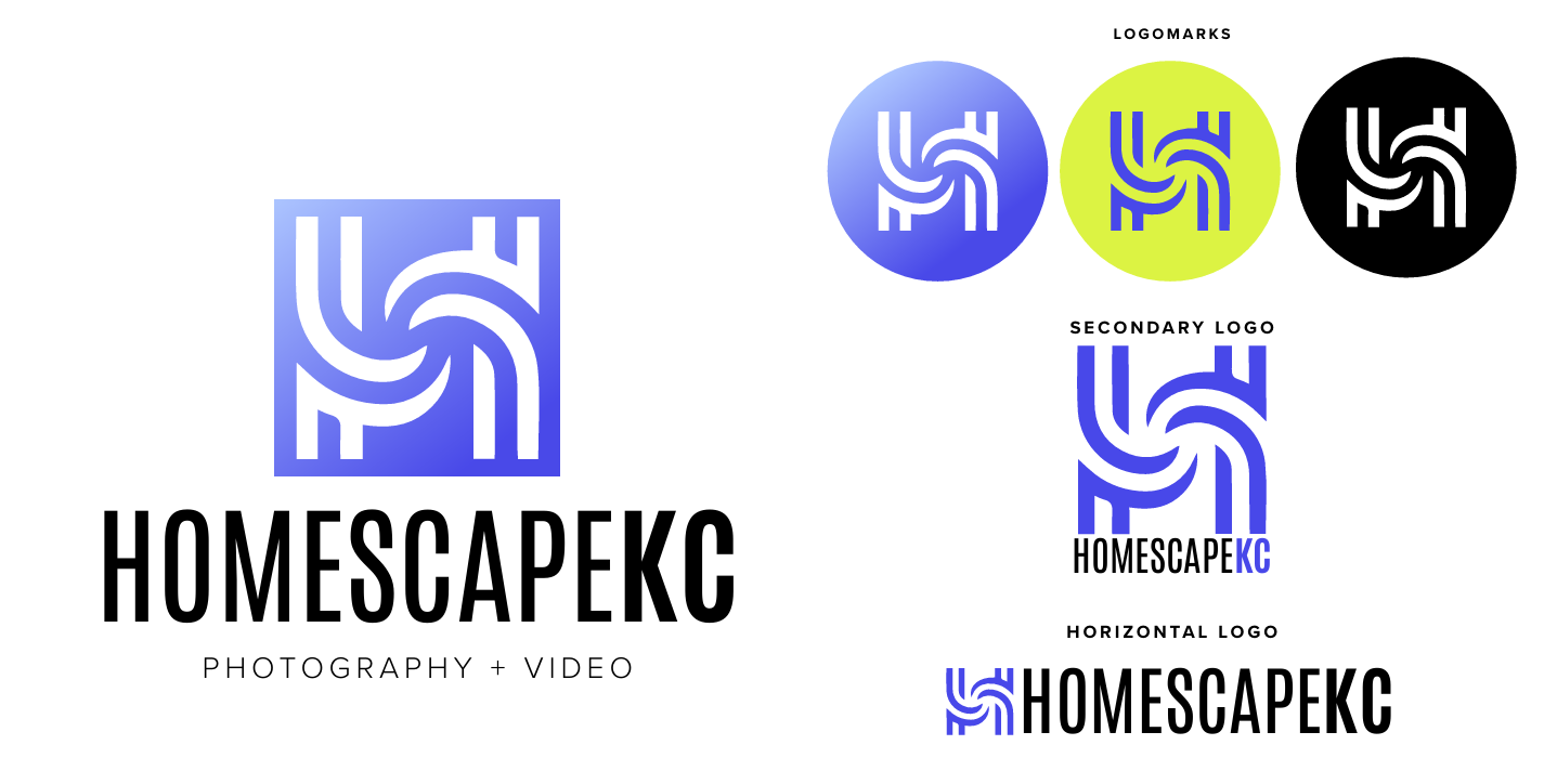
The Innovator
This design embodies a sleek, technological aesthetic with cutting-edge features. The “H” logomark cleverly resembles a drone, emphasizing the brand’s connection to advanced technology and innovation
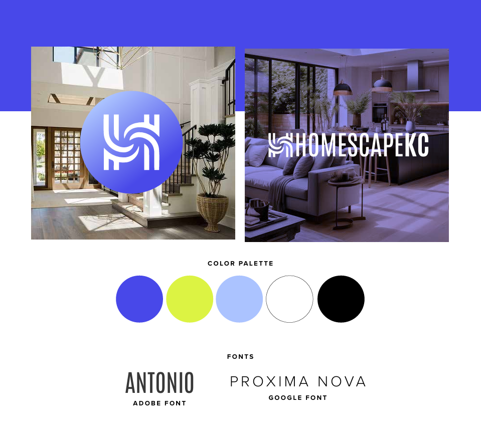
The Dynamic Spirit
This approach offers a vibrant, playful look that is truly eye-catching. The gradient introduces dynamic color transitions, adding depth and visual interest, while a bold color palette enhances its lively appeal.
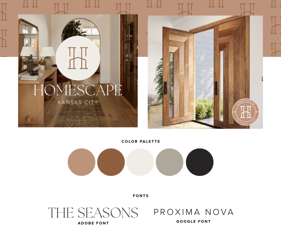
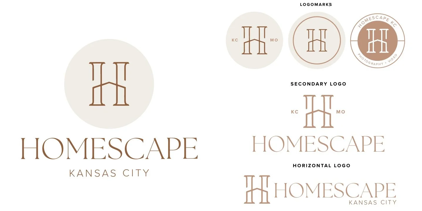
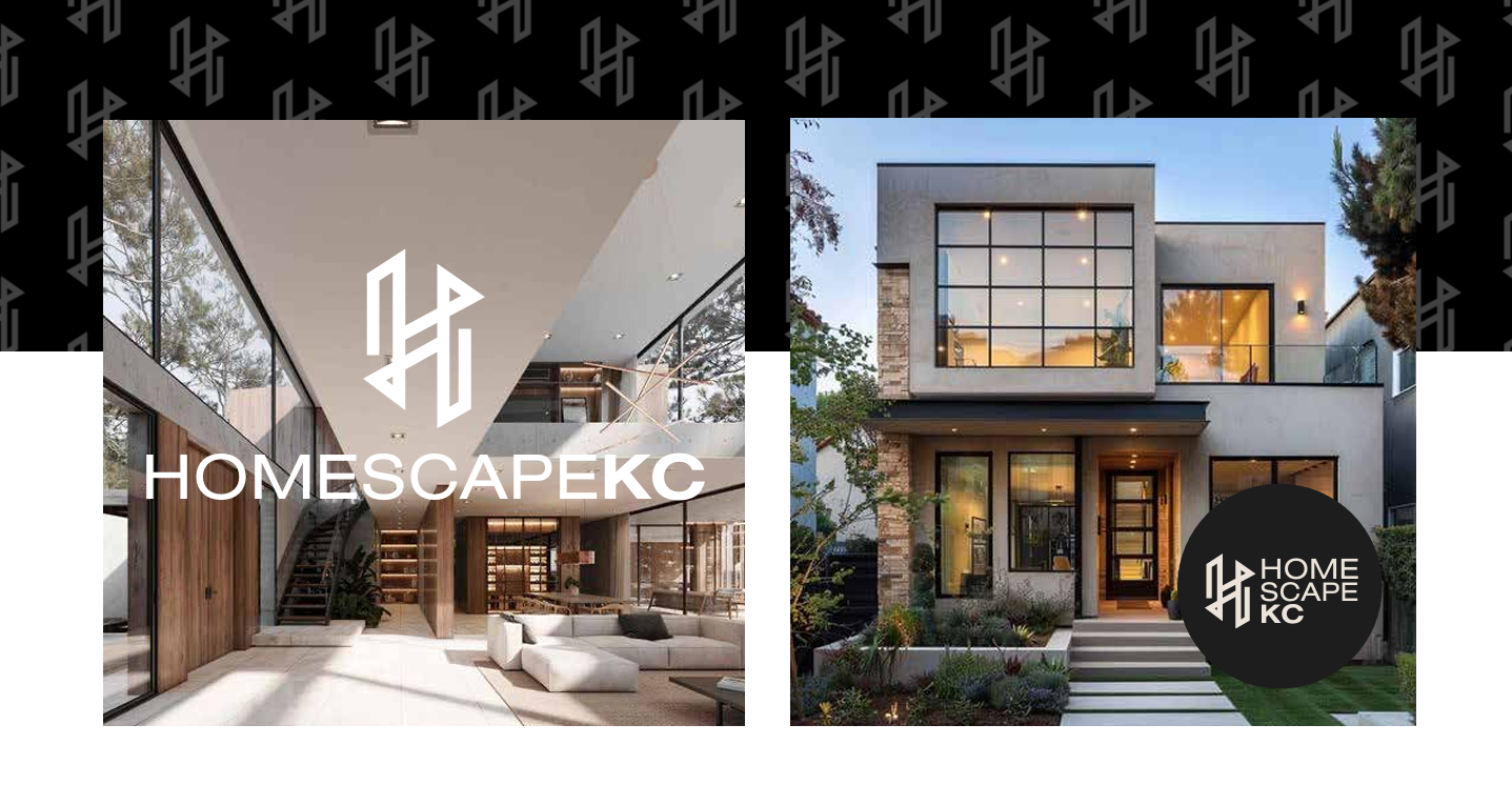
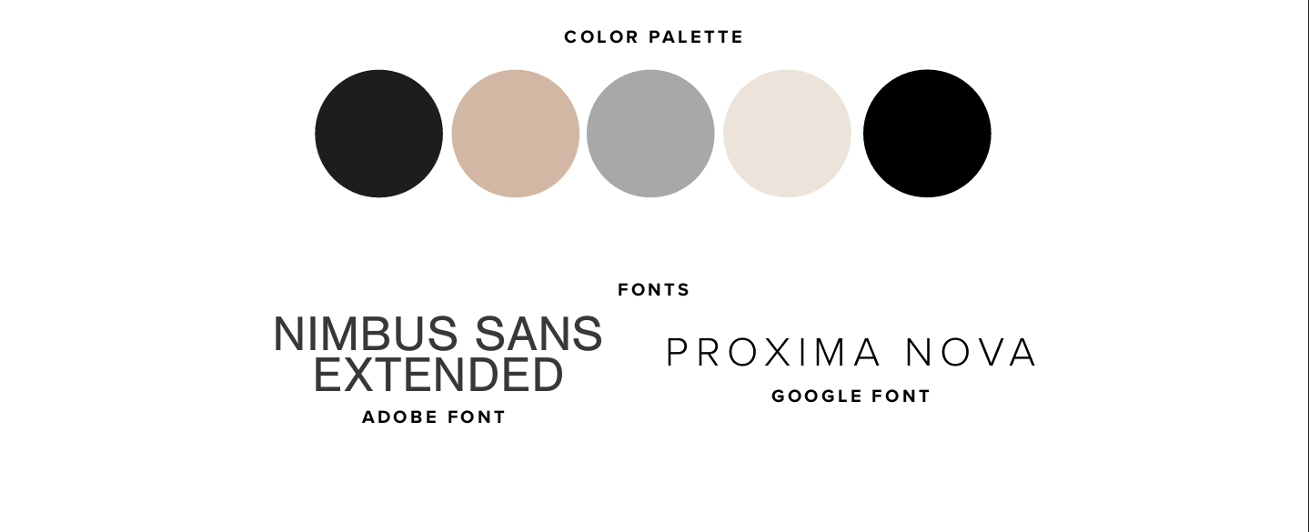
The Modern Classic
This logo design exudes luxury and comfort, combining a homey feel with elegance. The neutral color palette ensures versatility and timeless appeal. The serif logo mark adds sophistication with modern touches, creating a perfect blend of tradition and innovation. This option uses the full spelling of Kansas City as a touch of formality.